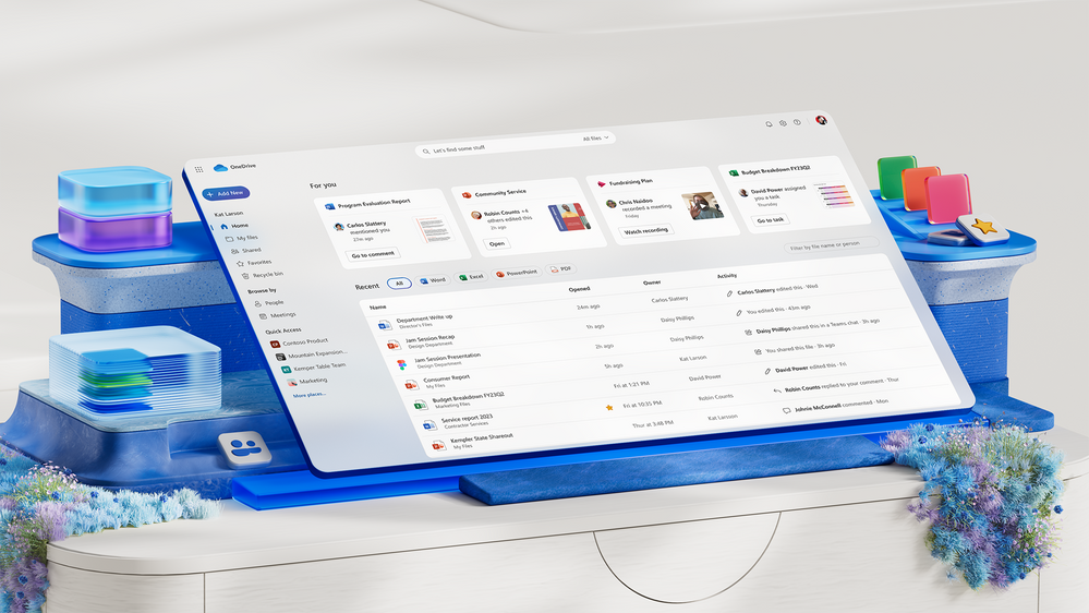
Microsoft is introducing a fresh design for its OneDrive cloud storage service, extending the Fluent design refresh announced last year to all OneDrive personal users by the end of February.
Described as a visual and functional upgrade, the redesign aims to streamline the user experience, enabling quicker access to files and better organization. Miceile Barrett, a Microsoft product manager, emphasized the reduction of clutter and distractions in the improved visual design, allowing users to focus on their content.
The updated OneDrive interface aligns more closely with the appearance of Windows 11 and Microsoft’s Office apps. Alongside a simplified and modernized main interface, a new people view is introduced, facilitating file location based on shared collaborators’ faces. This feature is particularly beneficial for users who recall collaborators but struggle with file names in a long list.
Microsoft has enhanced the OneDrive UI with new file filters, enabling users to sort files by type, such as Word, Excel, PowerPoint, or PDF. The ‘add new’ button now combines options for both file uploads and document creation using Office apps, improving user convenience.
Additional improvements are in the pipeline for OneDrive, particularly for business users. Microsoft plans to introduce offline support, faster load times, and various other enhancements to enhance the user experience.


